From the well-funded and delicately mapped out walls of any WeWork location to the bean bags and rustic floors of your local coworking space, designing a flexible workspace from scratch takes a bit of trial and error before reaching the point of being a fine-tuned craft.
AllWork caught up with Don Ball, co-founder of COCO, to take a deeper dive into what it really takes to design a flexible workspace.
We turned back the clock and asked Don what his initial vision was in terms of designing the very first COCO location.
DB: That was 7 years ago, so you have to remember that at the time coworking was more of a movement than an industry. Our vision was to create a place where innovative, collaborative people would choose to show up. It was that simple. As bootstrappers, we had to take our initial space as-is. So mostly, we found ourselves compensating for the idiosyncrasies of the space.
…that said, we knew a couple things for sure:
One, that the space needed a social focus. So, we took the front of the space, which had big picture windows and the previous tenant’s kitchen, and used that space to set the tone we wanted to convey. The combination of light, food, coffee and music made this an attractive space for people to experience coworking for the first time.
Two, we felt it was important to keep things open. Ideally, we would have had one huge open space. But we were stuck with a bunch of wing-walls that had been left in place by the previous tenant. We couldn’t afford to ‘tear down’ the walls and re-run the electrical, so we had to turn them into something that would work for us.
That was the birth of what we call “campsites” – our semi-private group workspaces with only 3 walls. We told people, “You can’t have a 4th wall and door, because that would stop collaboration.” In a sense, we were just making that up, but it turned out to be true. Today, our group spaces are split evenly between campsites and suites. Suites are popular – and in our view necessary – but given the choice, some members still prefer the openness and energy that you can only get from a campsite.
Now with multiple locations, do you design each space with that specific community in mind? Or do you keep a centric design theme across all spaces?
 We juggle a few considerations in designing our spaces. One is cash flow. No matter what, the space has to support the types and numbers of memberships you need to sell in order to stay in business. And you have to balance that with what features and amenities your members need and want. Somewhere in there, you’re also working in aesthetics.
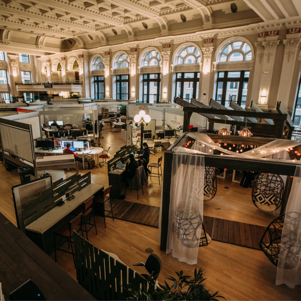
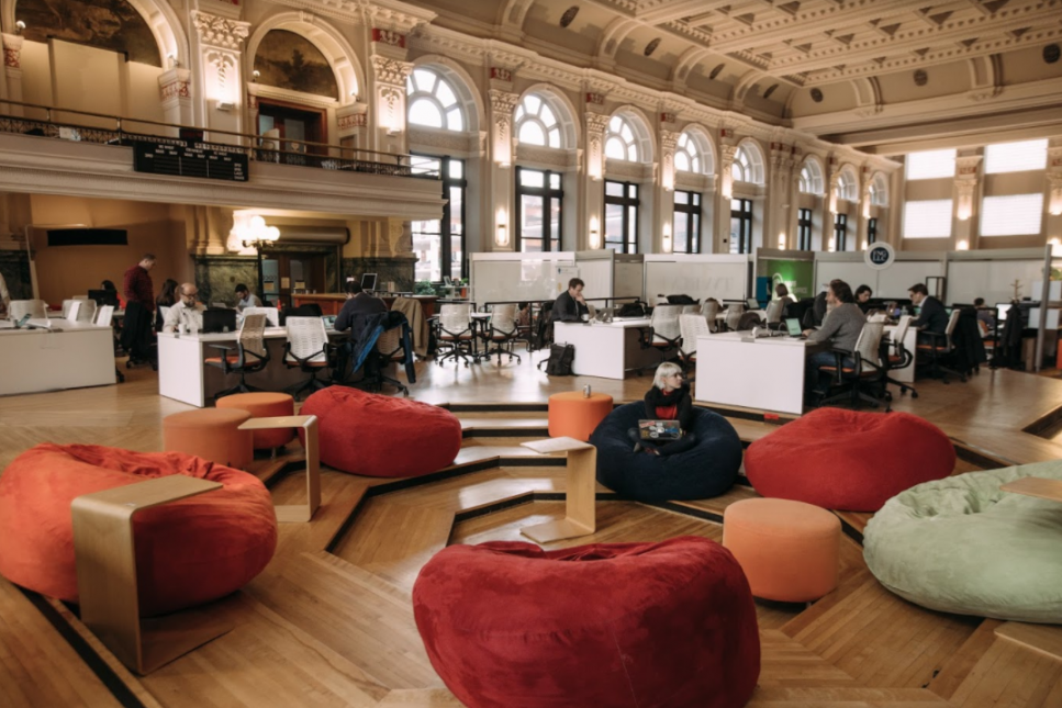
We tend to work with unique buildings and floor plans, so we often design in reaction to the space. For example, at our flagship space in the historic trading floor of the Minneapolis Grain Exchange, the existing room was built in 1903 and is very ornate. That default aesthetic (which we couldn’t alter because the space is historically protected) caused us to select more sleek, modern furniture and finishes as a complement.
By contrast, at our Uptown Minneapolis space, which is in a concrete walk-out basement, we went with a very warm design palette with lots of rich color and texture to warm the space up. So, I’d say that we’re flexible about how we approach our spaces. Some functional aspects have to be accounted for – like flow, commons and group spaces, phone booths, meeting rooms, etc. – but we design each space to be unique. And our members seem to enjoy the different feel that results. Many will visit different spaces on different days, because each space has its own vibe.
How important is it for space owners/operators to be flexible in their initial design? Should they put as much effort into designing their space to meet the needs of its tenants as they do into finding a great location or other community building aspects?
Flexibility is key in any business, is it not? I get the appeal of implementing a universal design across all locations, but we’ve never had that luxury. In order to get a good deal on our leases, we’ve had to consider spaces that are non-obvious, which then has forced us to be flexible in the design stage.
Regardless, you’ve got to solve for the needs of your tenants. That includes the design of the space itself, obviously. We design our spaces to have zones for different work modes, so people can modulate themselves and find their ideal mix of productivity, collaboration, and socializing.
The building location itself is just as important, but not in the same way in all cities. In larger, dense cities, being steps off mass transit is the ideal. But in 2nd- or 3rd-tier cities, which remain car-centric, proximity to affordable parking is key.
For experienced coworking space owners/operators: when should they be willing to give up on their design/aesthetics so that they can better meet the needs of their members/community? Or, if something can change more quickly such as prices, location, etc–should they fix those aspects first?
If we’re talking about fixing an existing business, then I’d imagine that you first need to understand which types of members are your most profitable. From there, you can make decisions that help you better serve your most profitable members. That might drive some big design decisions, like how much space is devoted to which membership types.
Aesthetics remain important, especially as competition increases and we see the fit and finish of spaces going up. But if the business is not working well at some fundamental level, then just amping up the aesthetics would be putting lipstick on a pig.
Is there any general advice you can give to anyone looking to start their own coworking space from scratch?
- Know who you’re serving (who you can market to, who can afford to pay you what you need, who is likely to stick around for some time).
- Design your space around them and their needs.
- Know how your space will garner cash flow (which might cause you to go back and make adjustments to Step 2. Not making enough money from the design? Reduce non-productive space, increase productive space.
- Leave some room for flexibility (think: moveable furniture & reconfigurable walls) because I guarantee you’ll be wrong about some things.
- Now, you can think about aesthetics.


