- Cowork Tahoe’s Jamie Orr investigates the science of color and its impact on the member experience.
- Some colors are known to soothe us, some to energize, while others distract or even aggravate us.
- From paint for walls to accent furniture, discover the best combination of colors for your workspace design.
The question, “Why is the sky blue?” is a hallmark of childhood curiosity. But how many of us really remember how to answer this question?
Similarly, how many of us know why the objects around us look the color they do?
The colors around us affect our perception of the world more than we realize. They impact our moods and how we interact with the world and one another. Some colors are known to soothe us, some to energize, while others distract or even aggravate us.
So, why is the sky blue and your favorite sweater green?
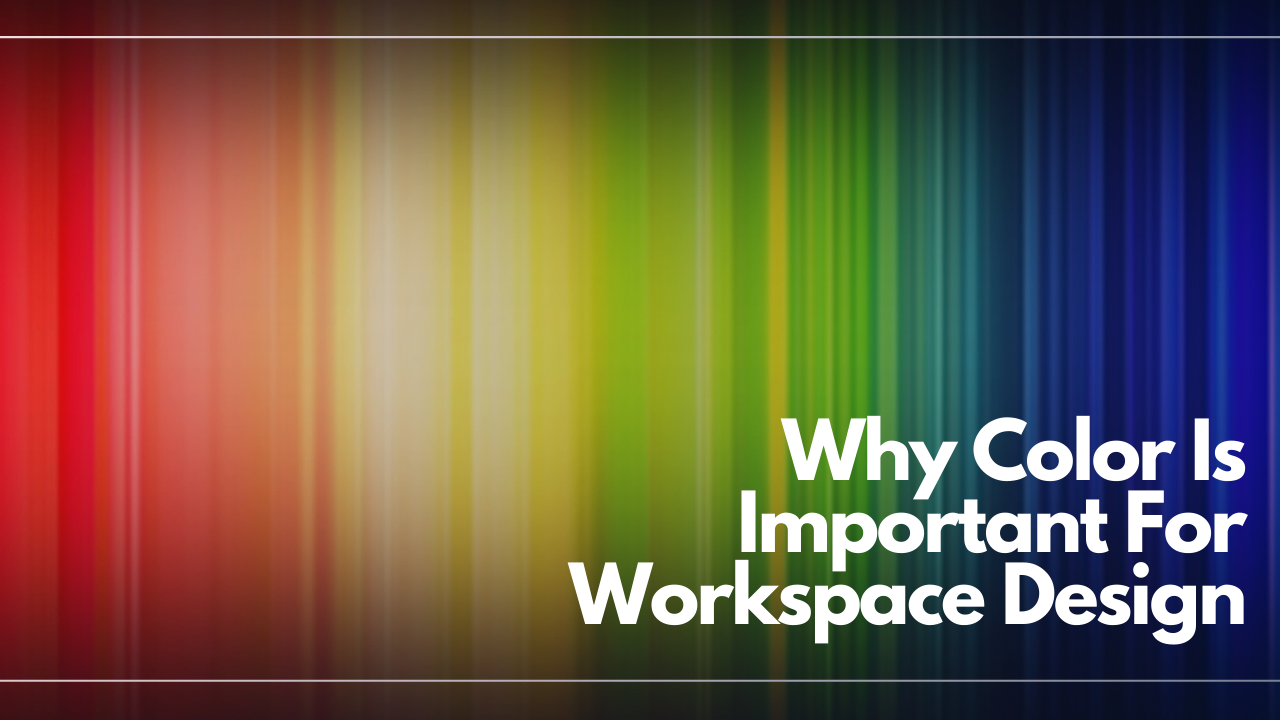
It all starts with light. Specifically, visible light. All light propagates around as waves, but human beings can only see those waves if they are within a certain range called the visible light spectrum. The color of light depends upon its particular wavelength with red having the longest visible wavelengths, and violet the shortest. This visible spectrum is most notable when looking at a rainbow after a storm.
Everything around us can absorb and scatter these waves of light. For the sky, particles in the atmosphere scatter sunlight in all directions, but blue light is scattered the most, so that is what we see. And that sweater? It’s green because the dye in the fabric is absorbing the reds and blues, leaving only the green reflecting back to your eye.
When it comes to workplace design, there is more to a good work environment than a comfortable chair and fast internet. The color of our workplace can also impact how we work, and color psychology is a growing area of interest for designers. Choosing colors that can increase happiness, productivity, and well being can help ensure that we are providing an enjoyable and effective place to get work done.
Here are a few things to consider about color when selecting everything from the paint for walls to accent furniture:
Cool colors: Blues, Greens, Purples
Shorter wavelength cool colors are excellent choices for workspaces.
Blue is a calming color that can be used widely throughout an office space. It can bring about feelings of security and stability, and is a favorite to support productivity as a result. Often underrated purple, with its close relationship to blue, is similarly soothing, but also luxurious.
As the most abundant color in nature, green is a good choice for spaces where people spend long hours as it is easy on the eyes and promotes feelings of balance. In one study, even brief glimpses of green were shown to enhance the creative performance of workers.
Warm colors: Reds, Yellows, and Oranges
Feelings of optimism, energy, and intensity are most associated with longer wavelength warm colors. Vibrant shades of these colors are attention getting, but that can also be distracting in a workspace over long periods of time. Yellows and reds are beneficial in spaces that are designed for bursts of creativity, but should be used sparingly where calm collaboration is needed, such as in conference rooms.
Tint, Tone, and Shade
Variations in the intensity of a color can also change its effect on a space. Pure hues, those that aren’t mixed with any others, are bright and cheerful, but can be too vibrant for most workplace activities. Similarly, blue that would otherwise elicit feelings of tranquility can become chilly and sombre in a different shade. It’s also important to pay attention to the tint, tone, and shade of a color.
Tint refers to how much white is added to a hue like green, red, or blue. Adding white lightens and softens a color that may otherwise be too intense. A red that is too bold or strong can be tinted to a more playful and calming pink.
Shade refers to the addition of black, creating deeper and darker colors. Darker blues feel more professional and mature, but can also make spaces feel smaller compared to lighter shades.
Adding gray adjusts the tone, making a hue less vibrant.
The White Wall Debate
In one often cited study on the impact of wall color of worker performance, it was shown that workers made more errors doing their tasks in an all white office as compared to a red or blue-green office. Yet, most offices use white walls throughout the space. To combat this, breaking up the monotony is important. Using plenty of colorful accent pieces, artwork, furniture, and plants can help create the same beneficial feelings as using those colors on the walls themselves.
Regardless of what color palette is ultimately chosen, color is a powerful tool to help create a productive workplace. Effective workplace design must take into account how people react to color. As light waves scatter all around us, what reaches our eye has a substantial impact on how we perceive the world, and our ability to interact with it.


