- Incorporating inclusive design strategies into workspaces results in more comfortable and positive experiences for workers.
- Accessible restrooms, ‘softer’ interiors, and clear signage are just some of the ways design can make a space more accessible.
- Below are a few examples of how designers are redefining public spaces to make them more accommodating for those who require these environments to be more inclusive.
This article was originally published on Work Design Magazine.
The future of the office is changing. More than half of US workers prefer a hybrid work model, splitting time at home and in the office. Workers want to return to the workplace while keeping the benefits of flexibility and access to privacy they’ve enjoyed while working from home.
A blended solution can result in a better and safer experience for everyone. Incorporating inclusive design strategies into spaces can also result in more delightful experiences for workers.
In the US, code regulated spaces generally meet the needs of most people. However, these codes are often minimum design standards and not always up to date with addressing the needs of today. This is where Inclusive Design is essential.
What is Inclusive Design?
Its roots began with the development of Universal Design. A multidisciplinary group of experts wrote The Principals of Universal Design in 1997 as a tool for providing guidance in both design and evaluation activities.
The goal of Universal Design is to maximize usability by individuals with a wide variety of characteristics. Whether talking about learning strategies or physical space, Universal Design operates by a set of principles designed to maximize access by everyone.
Key principles of Universal Design include the following:
- Equitable use – When every person can experience and use the space, regardless of their background and abilities.
- Flexibility use – When design accommodates a wide range of individual preferences and abilities.
- Simple and intuitive use – When people can use the space without assistance or help from someone else.
- Perceptible information – Regardless of someone’s sensory abilities, the space is suitable for them to use
- Tolerance for error – When design minimizes hazards, accidents or unintended consequences
- Low physical effort – How a space can be used easily and efficiently with minimal effort.
- Appropriate Size and Space for Approach and Use – How a space accommodates a wide variety of people regardless of physical capabilities or mobility.

As designers work to meet the needs of individuals in physical spaces, it’s critically important to adhere to the following goals for inclusive design and universal design. These steps can help to ensure every individual using the space can thrive in it.
- Body Fit – Accommodate a wide range of body sizes and abilities
- Comfort – Keep demands within desirable limits of body function and perception
- Awareness – Ensure critical information for use is easily perceived
- Understanding – Make methods of operation and use intuitive, clear and unambiguous
- Wellness – Contribute to health promotion, avoidance of disease and protection from hazards
- Social Integration – Treat all groups with dignity and respect
- Personalization – Incorporate opportunities for choice and expression of individual preference
- Cultural Appropriateness – Respect and reinforce cultural values, and the social environmental contexts of any design project
Inclusive Design in Everyday Spaces
As designers become more cognizant of the environment in which they work and play, often, work and public spaces are taken for granted by most of the general population as people go about their daily lives. But, to those who rely upon specially designed spaces to meet – and exceed – their needs, these universally designed spaces are greatly appreciated.
Below are a few examples of how designers are redefining public spaces to make them more accommodating for those who require these environments to be more inclusive.
More Accessible Restrooms
Provide larger maneuvering space. A 60” turning radius can be helpful for someone in a wheelchair but increasing the clear turning radius to 72” or 84” can be more valuable to a larger group of people and caregivers who may be with them in the restroom. A few years ago, a woman in her 30s suffered a hip/hamstring injury and two surgeries put her on crutches for 14 weeks within the same calendar year. Half of that time she also had a brace on her hip. Every day simple tasks were made more challenging. She learned to scope out “good” restrooms that had plenty of space to navigate with crutches, solid grab bars, and hooks. Since reaching down to pick up something off the floor was problematic, benches to place objects on, such as a backpack or purse, were even more desirable.
Often, we see ADA accessible and family restrooms adjacent to typical men’s and women’s restrooms. This can be tremendously helpful for a wide variety of people. Other project types can learn from this approach. A few years ago, while working to refresh a 20-floor project for an energy client’s space in a 30-year-old high-rise, every floor did not have an accessible restroom, but the client had a phasing plan in place to remodel each floor under a logical timeline. As part of the remodel, they pointed out a few experiences of employees undergoing transition for gender reassignment. In the time being, they wanted their staff to have a comfortable and safe place at any time. It was determined the best solution was to have a large unisex ADA accessible restroom on every floor located adjacent to the other restrooms. This allowed for all employees to feel equal and not be singled out.
“Softer” Public Spaces
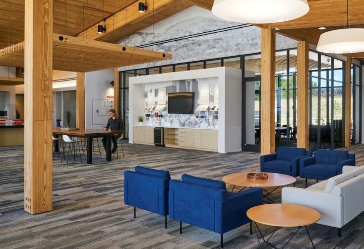
Make spaces more approachable and inviting to people from every class and socioeconomic background. High gloss materials, polished stone, hard surfaces can be intimidating to some people. It’s logical to see high end finishes in law firms and high-end hotels but consider warmer, more “comfortable” finishes in spaces open to the public. Soft materials such as carpets, textiles, plush seating and earth tone colors can make a space feel more inviting. With these enhancements, public buildings, such as government, medical, education and retail spaces can be more appealing to a wider audience.
We can also learn to take steps to make people from other areas feel comfortable experiencing new spaces. This can make environments appealing to those from outside a geographic area. When looking at designing spaces in cities, look at the people coming from a different area of the city, state, or country who may not be familiar with the space. Is the space comfortable and easy to navigate? Is the space in an upscale neighborhood? It’s important to think of people from every socioeconomic class. We must take into consideration how people from different backgrounds will experience space.
Greater Mobility
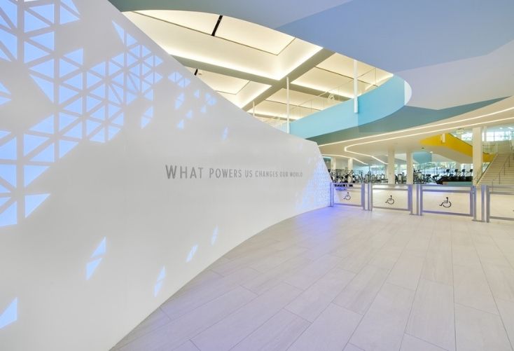
Design professionals are also sensitive to the needs of those with mobility issues and make spaces easier for them to get around. It’s a myth that only elderly population have mobility issues. Some mobility issues can be temporary, like from an injury when someone is on crutches. Sometimes mobility issues can be long term. People with mobility issues must have their needs considered for interior and exterior spaces. Parks and gardens are a great example of needs being met. Wider paved walkways allow for more people to navigate and enjoy the experience. Consider adding lighting to walkways to highlight them in different levels of daylight or cloudy days.
Clear Signage is Key
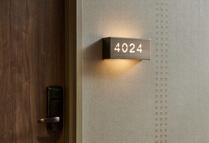
Consider people with different cognitive abilities and comfort levels. The world is a blend of many types of people. A portion of the population doesn’t feel comfortable asking for directions, can’t talk to others, or simply doesn’t want to interact. Good signage and wayfinding are critical. An introvert woman and her partner were going to an event. The couple had been looking forward to it all week. When the date arrived, they went to the venue, where they thought it was being held. They couldn’t find the event, looked around for a short time, made attempts to find it, but couldn’t and then went home. From a design standpoint, clear and simple signage could have prevented this failure.
Design professionals make things and spaces better through inclusive design. In addition to how public spaces have evolved to accommodate the needs of more people, recent research and survey results show that tomorrow’s workspaces will also be designed to meet the demands people want and need. Workers will benefit from having more concierge spaces, flexible spaces, more break out areas, small to mid-size huddle rooms, and more useable outdoor spaces. Timing is critical and now is the perfect time to be more aware of designing spaces for all individuals to thrive.


