- The Workspace Design Show in London is the UK’s only exhibition to focus solely on workspace design.
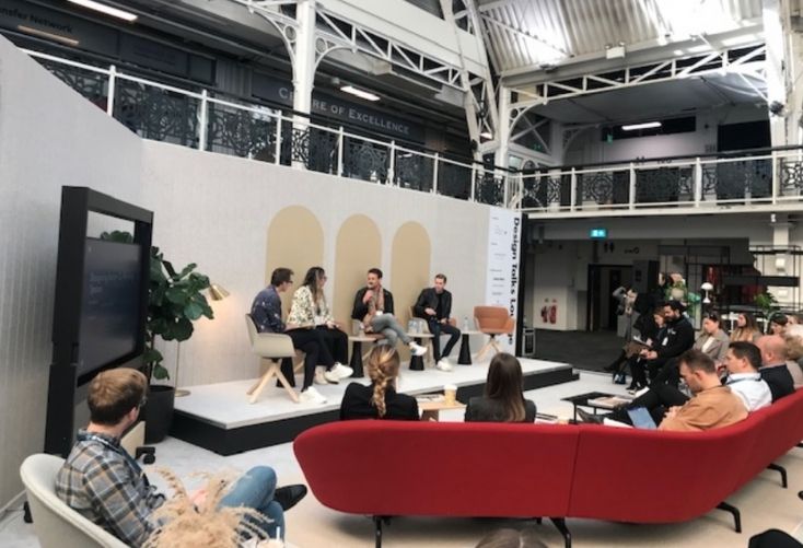
- Allwork.Space attended a discussion on how to design better coworking spaces featuring design experts from The Office Group, Oktra, and Co-Space.
- Here are the highlights of the discussion, including why emulation is better than reinventing the wheel and how amenity-rich spaces add value.
The Workspace Design Show took place on 4-5 November in London’s Business Design Centre. The annual event is the UK’s only exhibition to focus solely on workspace design.
After 18 months of virtual conferences, we couldn’t help but seize the opportunity to meet up with industry movers and shakers in-person again.
Together with exhibitions, tours, competitions and workshops, attendees could attend a series of workspace design conversations led by workspace and design specialists.
Hotel Designs’ editor, Hamish Kilburn, led a discussion on how to design better coworking spaces. He was joined by Nasim Köerting, Head of Design at The Office Group, Dom Dugan, Creative Director at Oktra and William Stokes, Co-Founder and CEO of Co-Space.
Here’s what we discovered.
1. Companies are moving towards a collective design identity
Oktra is an award-winning office design company based in London.
Some of its more traditional clients shifted to coworking environments when their leases expired during the coronavirus lockdown, said the firm’s creative director, Dugan.
The appetite for community-led spaces is increasing.
Dugan described how, by moving to coworking, traditional tenants have “given up their identity a little bit and embraced communities more.”
Instead of focusing on branding spaces appropriately, the priority has shifted to creating hospitable work environments that contain a diverse range of work settings.
Stokes, co-founder of Co-Space, also noticed how “community” has emerged as a key tenant demand. People are eager to find out who else occupies their building which is why Co-Space actively encourages interaction through their workspace design.
“Nobody wants to come into an office and walk down the corridor and not know who the other businesses are,” he added.
2. We must accommodate different work activities
“There’s a huge push towards having a diversity of settings: making sure there are spaces for Zoom, meetings and focused work,” explained Köerting, TOG’s Head of Design.
“People want to come to the office and make sure whatever mood they’re in or whatever they’ve got planned for the day, they have the right space to support that.
“And collaborative spaces of course, because when we’re coming back to the office we’re really coming back so that we can be with our colleagues.”
3. Operators should throw away the design rule book
Some of the more established coworking operators have a tendency to adhere to a set of design rules they established two or three years ago.
This approach can restrict creativity, says Dugan. Younger companies, on the other hand, are often set up to be more open minded to new approaches.
Young or old, the panellists agreed that it’s important for workspace designers and operators to work in tandem. There are things operators may have more expertise in, such as data about occupier needs and trends. Designers can bring creativity to the table.
4. Companies are looking for amenity-rich spaces
Köerting believes that amenities – meditation rooms, spaces for parents, gyms, cafes, etc – are going to attract people back into the office. In other words, the additional facilities that people can’t access in their own homes.
“From a business point of view it might not be a revenue producing space, but at the same time it is a draw for people and larger and smaller corporations.”
Interestingly, TOG has noticed an increase in demand for prayer rooms.
“It’s more and more being demanded by our clients,” noted Köerting. “So we’re going back into some of our older buildings and retrofitting them.”
“It means we’re creating spaces that accept diversity and know that people are different and need different spaces to do what they need to do in their work day. We’re not robots anymore that have to work in a certain way.”
5. Coworking design has become “aspirational”
Stokes has noticed how office design schemes have become somewhat “aspirational”.
“It doesn’t look like the office of the ‘90s or ‘00s. It reminds you of home and looks and feels like a private members’ club. That’s what we focus on – members’ clubs without the ego.
6. It’s important to get it right behind the scenes
Instead of paying too much heed to what we can see, workspace operators should invest in what goes on behind the scenes with things like air and lighting, emphasised Dugan.
In terms of lighting, Köerting said TOG seeks out buildings and spaces that are abundant with natural light “because we recognise that’s really important for wellness and humanness. We need natural light: first and foremost.”
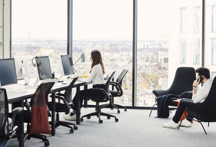
Circadian lighting is lighting that follows the human body’s natural sleep/wake cycles. It has the potential to positively impact people’s health, alertness and productivity.
Although identified as an emerging trend, circadian lighting has significant cost implications currently. Perhaps it will become more cost-effective when the market catches up.
7. We can learn a lot from retail and hospitality
According to Dugan, client satisfaction is determined by their level of “comfort”.
Köerting agreed that comfort, together with function, are key. In terms of inspiration, “hospitality is a huge thing for us; comfort is a huge thing and hospitality has nailed comfort.”
TOG’s design team also looks to retail for inspiration. “Retail has become so bold and punchy that we look at it a lot from a design perspective.”
“We tend not to look at workspaces as much because it’s not about producing the next thing; it’s about innovating and producing something different.”
“Subconsciously, it’s so important to design three-dimensionally as opposed to just a look of place. It’s all about the feel as well,” added Kilburn.
As well as admiring TOG and Soho House’s approaches to design, Stokes is a huge fan of the athletic apparel retailer Lululemon, from a 3D customer journey perspective.
“I walked into the store in Richmond and there was this incredible smell.
“Now that’s the smell I have in my reception area. There’s things like that where spaces have done something really well, so you think let’s not reinvent the wheel – let’s emulate.”
8. We should design for context as well as occupiers
Anyone familiar with TOG’s spaces will know that each building has a different design aesthetic. “We’re not going to design something in Shoreditch that’s the same in the West End – it’s a very different market,” said Köerting.
“We make sure that we design each building differently which is tough because we have a lot of buildings. But we realise how important it is for the client and to pay homage and respect to the context and area they’re in.”
Internally, TOG brands its buildings in a subtle way. Instead of being called “TOG” spaces, each building has its own name, such as Tintagel House (Embankment) and Thomas House (Pimlico). This helps clients cultivate a stronger affiliation with the building.
9. Be bold, receptive and willing to evolve
When questioned about how they’re going to approach coworking design moving forward, Köerting said TOG will go boldly and continue to design in a classic way.
“It’s not a time to apologise and be subtle about anything: it’s a time to really evolve and create beautiful spaces that attract people, and try our best to research and find out what people need and really interrogate what we’re currently doing to make sure it’s right.”
Following trends can be unsustainable from an environmental perspective, which is why Köerting recommends “always trying to keep your eye on classic design that’s going to be timeless, especially when it comes to furniture.”
For Stokes, it’s all about “being receptive to your clients’ needs and meeting their demands.
“Typically, I look at the design we sign off to last around five years. At the three year mark we assume we’ll have to do a light refurb and at the five year mark we’ll probably have to adapt to where the market is going.”
If you missed the Workspace Design Show, don’t worry – this is the first of three articles summarising what we learned during the two-day event.


