- Joe McGinley, CEO Iconic Offices, explains how maximalist design enables their workspace brand to stand out in a competitive marketplace.
- Typified by wildly juxtaposed colors, patterns and textures, maximalism often encompasses collections and artifacts sourced over time and travels.
- Maximalism has been associated primarily with fashion and residential environments, but it is now being used to create high impact workspaces.
Creating a distinctive environment infused with maximalist design can be a multi-pronged tool in the operator’s toolbox. It’s capable of wowing clients, attracting and retaining talent, expressing branding, and even balancing risk in a real estate portfolio, according to a multi-location European firm.
What exactly is maximalism and where did it come from?
Maximalism spaces are layered and rich, full of pattern and color and mixed finishes; they play with scale and proportion and aren’t afraid to be fun and eclectic, according to Ruth-Anne McMillan of McMillan Interiors of Dublin.
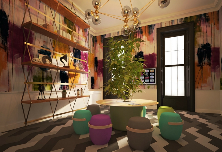
In addition to wildly juxtaposed colors, patterns and textures, it might also encompass visible collections, art and artifacts sourced over time and travels.
Much like politics, design cycles swing in popularity. Some call the “more is more” mode a response to restraint that many years of minimalism and modern design imposed. Maximalism has been noted as modern design’s expressive side, a style that allows designers more freedom and consumers the opportunity for personal expression.
Another theory points to maximalism’s excess providing a multi-sensory counterpoint to today’s overdose on two-dimensional screens.
Up until recently, maximalism has been associated primarily with fashion and residential environments, where disparate elements are blended into a single environment and collectibles. But it is now being used to create high impact work spaces.
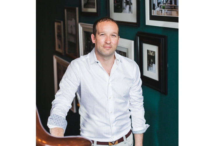
For Ireland’s Iconic Offices, the design is a business strategy first and foremost, according to CEO Joe McGinley, whose firm leverages a portfolio of historic buildings and unrestrained design to successfully compete in a crowded and competitive marketplace.
Since all 15 of Iconic Spaces’ properties are in Dublin’s central business district, it became even more necessary to create unique identities and community for each environment.
“Every project is totally unique,” explained McGinley, who also supervises design of the spaces. “We feel that when you design a space that’s different from another, you attract a different type of client. That gives us a more diverse portfolio and lower risk.”
“If you focus exclusively on one sector, and that industry goes down, you’re obviously in trouble.
“Our philosophy is in order to have a strong community, it should be a diverse community, so we’re not targeting any specific sectors. In fact we welcome as many different sectors as possible. We feel that’s what makes the space interesting.”
In some cases, the result does not match up the intent. But that does not make it any less successful.
“We designed a space that we thought would appeal to the tech community at the time,” he recalled.
“It ended up all finance and legal.”
“It was young, innovative firms who took the space because they wanted to give the staff somewhere inspiring to work. They bring their clients to that building, and it reflects their brand.”
Iconic is now guided more by instinct. “We try to build space we and our friends would like to work in.”

“We build space for innovators. It doesn’t matter what sector of the market,” McGinley noted. “Our space is aspirational. It’s where our clients want their brands to be in the future.”
Oftentimes the building’s origins guide the design.
“We typically are chasing older products that have history and give them new life,” notes McGinley. “We feel a building with history is a more warm and welcoming space.”
“Plus, heritage buildings lend themselves to maximum-focused design style with that attractive mix of old and new,” McGinley added.
It is a technique that has visibly separated them from many other operators.
“Design is one of our main competitive advantage in the Dublin market. We constantly hear back from clients how much they love working in the space, how they feel the space inspires their staff and adds value to help them attract and retain staff.”
[huge_it_slider id=”23″]
Implementing maximalist style need not be terribly expensive or permanent, according to McGinley. The former home furnishings professional shared some tips on how to integrate maximalism into office space, with a focus on techniques that can be moved or adapted elsewhere/updated easily.
- Aim for one-off properties. “Historical or heritage buildings provide good USP against larger global brands who target new glass box office buildings,” says McGinley. “It lets you do something different and create different experiences.”
- Find inspiration from within. Find one or two elements to work as anchor pieces, McGinley advises. “It might be a piece of wallpaper, statue, café.”
A unique feature of the building makes it more memorable to prospects, visitors and clients, such as the an 8-foot tall Robocop statue in the window of Iconic’s Pembroke Street building.
“A lot of people know that building by that statue,” McGinley recalled. Thus one primary goal of marketing – building awareness – was already done for them. “It’s not something you’d associate with legal and finance.”
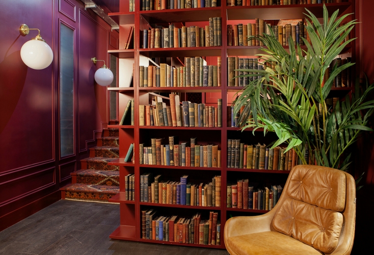
- Concentrate on a few feature rooms. McGinley tends to focus statement design on libraries, breakout spaces and meeting rooms, leaving office suites minimal enough for companies to customize with their own branding and personality.
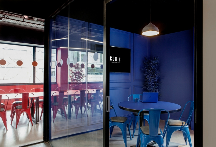
- Go big with paint. Iconic used color dipping to differentiate Brickhouse, creating high impact monochromatic rooms. The kitchen and café feature blue from top to bottom; a conference features red walls, tables, chairs and even coffee cups.
- Use collectibles for a more personal, lived-in look and allow time for procurement. As chief curator for his spaces, which incorporate a lot of libraries, McGinley spends a lot of time sourcing vintage books from rare book dealers in London.
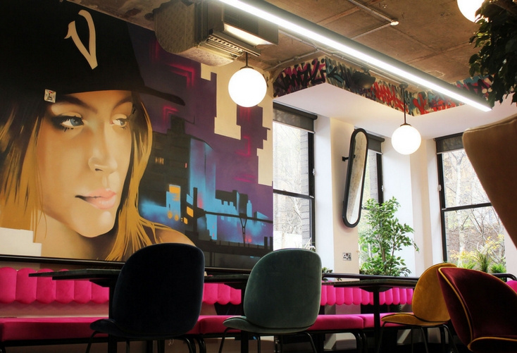
- Mix materials and motifs, patterns and colors. Suede Gubi Beetle chairs are juxtaposed with graffiti and lushly planted surroundings in The Greenway’s cafe. It makes for an irresistible choice, according to McGinley. “People absolutely love that space,” he said, noting it is much preferred over meeting rooms. “When the clients come in, it blows them away. Everyone wants to do their meetings in the café.”
- Use saloon hanging. It can add an inexpensive, accessible touch of maximalism to a stairwell or along a wall. Mix modern picture frames with older salvaged frames in different colors and varied styles artwork, McGinley suggests.
- Go crazy with plantings. It’s a reasonable way to add drama and create a very warm and inviting environment, says McGinley who integrates live, artificial plants and vertical living gardens throughout his spaces. “It’s a great way to get maximalism into a building in a cost-effective way that’s also very flexible. You can move it away if the space configuration changes, or even extract and use in other buildings, which is a lot more difficult to do with furniture and other large items.”
- Balance maximized spaces with lighter touches. Maximalism doesn’t always have to mean cluttered and over the top, according to McMillan. “I love finding spaces that go high-octane but then rein it back it in to get a very cool mash-up of maximalism and minimalism,” she noted, citing Iconic’s The Greenway space. “A high octane color and mix of finishes (marble/metal/the pink quilted wall/ the blue tiled wall/ the INCREDIBLE flooring), is buffered and balanced with its use of clean lines and shapes, and block colors and large patterns. It prevents it from being too loud and shocking.”
- Leave room to breathe. The busyness of maximalism demands a quiet a counterpoint. “When you have a lot of pattern close together, try to keep a lot of empty space,” says Milan-based designer and trend forecaster Andrea Dell Olio. “You need to create space for mind to think.”


