- Creating a great, human-centric workplace experience requires that design take into consideration all of our human senses.
- The stimuli we are exposed to in the built environment can encourage or detriment productivity.
- Colors play a key role in how we perceive things and they also greatly influence are mood, emotions, and feelings.
This article was updated in June, 2019
Multisensory design is a human approach to design. Companies hoping to create a unique human experience workplace should take into consideration all of our senses in order to create a truly awe-inspiring experience.
Scents, smells, sounds, views, and textures greatly affect our mood, feelings, and perceptions. In built environments, the sound of water can help relax individuals, the scent of rosemary can help improve memory, and access to natural views can help reduce a person’s stress response.
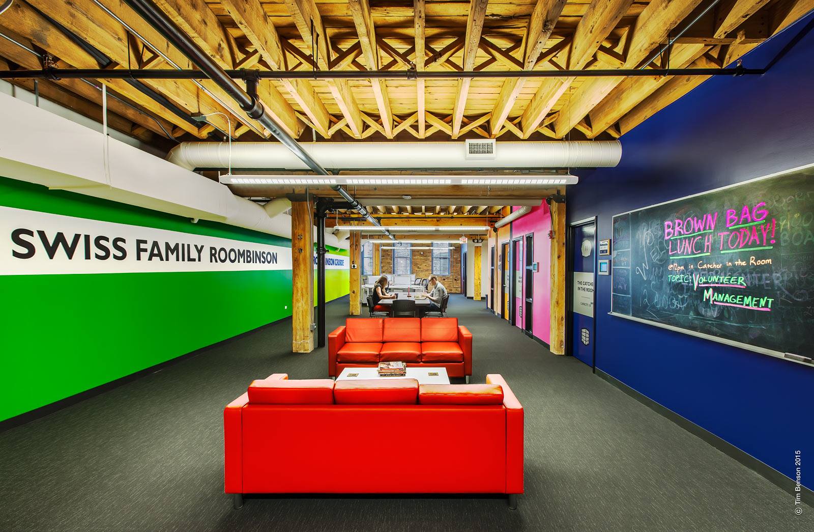
Let’s take color for example. If the color of a plate affects our appetite and influences how food tastes to us, just imagine how the color of your workspace walls, furniture, or rugs influences your coworking space members’ productivity and behavior.
The Psychology of Color: The Role of Color Beyond Aesthetics
Though color in the workplace is mostly used to improve aesthetics and branding, there’s ample research that documents the effects of color on mood, wellbeing, and behavior — and not just in the workplace. Some examples, gathered by Verywellmind, that look at how color affects different areas of our lives include:
- A study that found that warm-colored placebo pills were reported as more effective than cool-colored placebo pills.
- A study that found evidence that suggested that installing blue-colored streetlights can lead to reduced crime in those areas.
- A study that found that the color red causes people to react with greater speed and force.
- A study that found by looking at historical data that sports teams dressed in mostly black uniforms are more likely to receive penalties and that students were more likely to associate negative qualities with a player wearing a black uniform.
Understanding how color affects us is key to creating an efficient workplace environment.
The academic study “The Effects of Colour in Work Environment: A systematic review” by Nattha Savavibool, Birgitta Gatersleben, and Chumporn Moorapun examined how color in the work environment affects mood and emotion, physiology and wellbeing, and work-related outcomes.
Key findings from the study include:
Colorful workplaces tend to enhance performance more than workplaces with achromatic schemes.
Blue
- One of the most common favorite colors
- Associated with feelings of wellbeing
- Perceived in a more positive light than red in open-plan environments
- Also perceived as depressive and can be associated with sleepiness and drowsiness
- It improves performance in creative tasks
Green
- One of the most favorite colors
- Associated with a sense of wellbeing
- Evokes positive emotional responses; it’s associated with relaxation, happiness, and innovation
White
- Favorite neutral color
- Workers prefer to work in white environments
- Can be perceived as boring
- Working in white environment results in most errors being make
Red
- Perceived as stimulating and distracting
- Impacts heart rate and is associated with putting the brain in a more excited state
- It has been reported to have negative and positive effects on performance
- Enhances cognitive task performance
It’s not just red, white, blue, and orange that affect our mood and behavior. Yellow, orange, purple and others greatly impact our perceptions. Furthermore, different shades, hues, and finishes of the same color affect us differently.
Below is an infographic created by Quill that visualizes the various ways in which color can affect performance in the workplace.

Feature image: Chicago Literacy Alliance


