- Wellness is one of the most important aspects of today’s workplace design
- The workplace is a valuable tool for organizations seeking to attract and retain talent
- Organizations are approaching workplace design holistically, thinking about how the physical space intertwines with website design, graphics, and brand identity
The workplace has become a key part of the work experience. It’s no longer enough to have a pretty space; companies have been forced to think about elements such as wellness and community in order to attract and retain the best talent, and also to have a more productive workforce.
Just as the eco-friendly movement a few years back gave rise to sustainable building certifications, the wellness trend surrounding various aspects of life today has given rise to certifications that promote the creation of spaces that are human-focused and improve health and overall wellbeing.
Boston-based Analogue Studios has specialized in delivering a holistic approach to design. Founded in 2011 by Vince Pan, Analogue has worked with various coworking operators to design spaces that are sophisticated, inspiring, and community driven.
Allwork.Space spoke with Pan about workplace design and one of its latest projects, the design and build out of Workbar’s Back Bay location, which is the first ever coworking space designed to meet WELL building standards.
Allwork.Space: Your website states that Analogue is an interdisciplinary studio. What does this mean and what advantages does this give you?
Vince Pan: We are an interdisciplinary studio because we practice architecture, interior design, graphic design, branding, exhibit design, industrial design, and website design. Our team is made up of individuals with experience in various areas.
Having a combination of experts means we have more tools at our disposal and it gives us the ability to approach design challenges and problems differently. Usually, the clients we take on are clients that need more than just traditional architecture and interior design services. Our projects include working on architecture and design, but also graphic design, branding, and signage. For example, we’ve worked with various companies that need help creating their identity, picking out a name, and picking out the right location.
It leads to a much richer design process.
Allwork.Space: Let’s talk about workplace design. What are some trends you’ve observed and where do you see these going?
Wellness is becoming more and more important. It’s actually interesting to see how the wellness trend has evolved. Wellness is the next wave now that sustainability is, for most organizations, kind of assumed and expected.
One thing that’s gained a lot of strength recently among our clients is the use of workplace design as a tool for talent recruiting and retention. Companies want a space that will WOW their clients, as well as their staff. Workplace design today is about much more than designing a pretty picture. Companies and individuals are seeking culture and community when they see office space. Most organizations have already realized that this is helping to retain talent, and this goes very well beyond architecture. Office design is, today, about how people interact with the space, how they circulate and use it. This is why our approach at Analogue has been about design systems, as opposed to individual design elements.
Other than wellness, there’s also been a big move and push for open, high density spaces. We’ve already started to see a backlash to this; companies need to better calibrate the use of open space alongside private space, while also finding ways to incorporate different moods and settings that can help people get work done differently throughout the day.
Allwork.Space: You recently worked with Workbar to design their Back Bay location according to WELL Building Standards. What can you tell us about this project?
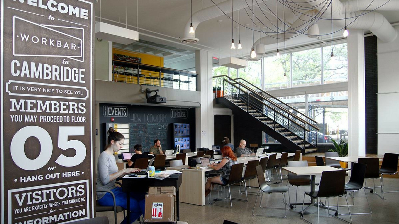
Analogue has been working with Workbar for about 6 years now; prior to this location, we designed their flagship space in Cambridge.
At Analogue, we first heard about the WELL standard a little over a year ago. When we first heard of it, we thought it was a natural fit for Workbar, considering the way they’ve been designing their spaces for some time now. One aspect I admire about Workbar spaces is that they are all very member-focused; for them it’s more about taking care of people, instead of focusing on how to grow a company faster. This fits perfectly with the WELL standard.
Although we did not start designing for WELL from the very beginning, it was fairly early in the process. Incorporating most of the requirements wasn’t as challenging because of this.
Allwork.Space: Speaking about challenging, Allwork.Space: in a recent interview with Allwork.Space, Workbar’s Bill Jacobson said that acoustics and lighting where a challenge ‘to get right’.
Yes. Lighting is tricky because WELL requires that light be about more than just illuminating the place of work. Light is one of the main drivers of the circadian system, which helps regulate physiological rhythms. In order to obtain the WELL certification, buildings must install lights that mimic what is going on outside. This meant that we had to work with consultants and lighting manufacturers to figure out all of the light specs and obtain a more in-depth level of understanding of how exactly these lights work. The lighting requirement of WELL has about 5 different components to it; it’s not just about a switch that can turn a light on or off. In order to be certified, lighting needs to change color and temperature, among other things, throughout the day. This meant that we had to design and work out a program that would make the changes accordingly; it was a very complex process.
As for acoustics, it’s not acoustics itself that is the issue. It’s about how acoustics relate to mechanical aspects, like HVAC systems. For the Workbar Back Bay location, one of the biggest challenges was that it had an open ceiling and a lot of sound and noise was coming from the HVAC system. To get the acoustics right, we had to sit down and examine all of the mechanical units, as well as the accessories. We had to find a way to make them quieter. This included some trial and error, like moving the units a few feet this way or that, measuring the impact it had on the overall space and establishing where it performed better. Just like with lighting, this required that we work with a team with a much higher level of acoustical expertise.
A lot of effort and thought go into designing spaces like these. One important aspect of WELL is that it will not make the space look different, but it will definitely feel different. And that’s what we are aiming for; workplace design, and standards like these, are promoting the creation of spaces that make individuals feel better, healthier.
Allwork.Space: Analogue’s portfolio includes working with several coworking operators. What can you tell us specifically about the design of coworking spaces?
Coworking is a specialty for Analogue. From a design perspective, one of the most complex things about coworking spaces is figuring out an organization’s approach to coworking. This includes thinking about the density companies are looking for, the neighborhood, and who will be using the space. This makes the design process a matter of figuring out the choreography of the space, the mechanics of it.
Density in particular is a big challenge for operators, as they want to fit in as much people as possible, but they also want to make sure people feel comfortable. Then, you also have the culture aspect of it. How do you want the space to present itself. If you think about it, coworking spaces are partially an office environment, partially a retail one, and partially a hospitality one. You are selling your space to people, but you are also hosting them; this makes the design process quite different from that of a static space or a single organization.
Additionally, operators have to carefully think about how much of their own and their tenants’ branding and identity comes through. While you don’t want your tenants’ posters and signage all over, you have to realize that they need to make the space their own.
Allwork.Space: Anything else you’d like to add?
Workplace design is being approached more holistically; how the actual workplace intertwiners with the website, the graphics of the space, the brand’s identity, etc. The expectations about design are very different today than those just 8 years ago. There’s a much higher level of sophistication, which is good; but it also means that the stakes are higher for everyone involved, from the property owner, to the architect, to the end-user.


