
Udo Schliemann, principal creative director at Entro, has the scoop on why more color — expertly deployed — can improve your workplace.
*This article, by Udo Schliemann of Entro, originally appeared in Work Design Magazine on April 13, 2017.*

Last year, a news story was released about the discovery of the world’s ugliest color, Pantone 448C, which was used by the Australian government on tobacco packaging to discourage smoking. This, and many other strategies are the result of the increasing amount of insight in recent years on color theory, which surrounds the meanings, effects, and use of color.
One of the primary items in the designer’s toolkit, the discussion around color is one that is always evolving. As we’ve entered this era of heightened focus on workplace design, color is now also a major consideration of psychologists and major businesses and organizations. It is a key quality of our visual perception, describing different frequencies of light through our familiar classifications such as red, yellow, or green. Our observation of different colors results from a unique combination of hue, tint, tone, and shade. It is one of the many ways we understand the world around us, and we often don’t realize how it affects many of the choices, thoughts and interactions we have on any given day. We think about color when getting dressed for work, or rely on the colored traffic lights to direct us on our commute. Our memories are filled with color, and we recognize some of the biggest brands through color.

What was once merely a stylistic choice is now used as a tool to connect employees to the organizational brand, by helping them understand who they work for and why.
Our color choices in the built environment are made not only through personal preference, but also through the knowledge of the benefits that certain colors can bring. We know that certain colors can positively contribute to happiness, productivity, and even physical health in a workplace. However, we cannot rely solely on a coat of paint to reach these objectives alone — it is the combination of color, lighting, and other environmental features that can make a space the most supportive for employees. Our work involves finding the right balance between customizing the space with unique company attributes, and ensuring it is a comfortable and enjoyable place for people to work effectively.
Making color choices
There are many theories about the effects of different colors, for example, that yellow can evoke feelings of optimism, warmth, and creativity. It is key to consider, however, that there are thousands of shades of yellow, which can have varying effects on the human psyche. Not only does the shade change how the color affects the environment and its users, other variables such as sheen, pattern, and translucency also affect how the color and overall environment is perceived. Other elements also change the perception of color — it can interact with light to create different observations of a space, for example, yellow-toned lighting can create a completely different color perception than a more cool-toned light. This is one of the reasons that early collaboration between interior designers, architects, and graphic designers is beneficial.
The effect of a certain color also changes the moment another color or group of colors is added. Much attention should be paid to color combinations as they are so specific and can make or break the overall setting. Designers follow basic rules of thumb for when combining different colors in a space, as well as multiple strategies that are tailored to different uses.
One general rule is that if all colors on the spectrum are used together in a space, this can actually be too predictable, becoming uninteresting for observers. In choosing a family of colors, it is more effective to eliminate one to two colors. Another approach is to choose complementary colors. This is beneficial for spaces like hospitals where we commonly see the color green in patient rooms. Green is said to reduce eye fatigue, important for doctors and nurses working in situations where being alert is more than necessary. As a complementary color to red, it also provides a visual break from medical equipment and blood.

Accessibility is another important social consideration for color combinations, as it is often mandatory in office spaces and the best way to accommodate as many needs as possible. This is especially pertinent in wayfinding and signage, where high color contrasts must be chosen carefully to ensure the maximum amount of visibility for users, especially those that have impaired vision. Other conditions may require special attention to the use of color as well. For example, those with Alzheimer’s or dementia may not be able to interpret a sudden color contrast, causing them to misunderstand their surroundings and trip or falter in another way.
For other purposes, another approach is to stay within one segment of the color wheel. This can create an environment with a certain character and can also help to designate “zones”. This approach was used during our work for the Toronto Pan Am Sports Centre, a legacy building of the 2015 Pan Am/Parapan Am Games. A somewhat unconventional workplace, the centre is now home to staff from the Canadian Sport Institute Ontario, University of Toronto Scarborough Athletics & Recreation, and City of Toronto Parks & Recreation while it continues to provide sports programming.
We were tasked with creating a graphics program that lasted beyond the games, bringing life to a traditionally sterile environment and tying these distinct organizations together through the shared love of sport. For areas near the aquatics section of the building, along with varying hues of blue, we used an abstract graphic form, influenced by waveforms interacting with light and shadow for large-scale wall treatments and as a key element on signage. Not only do users of the building feel the energy associated with the graphic representation, they are also in an environment that promotes a sense of calm and focus — favorable for both employees and athletes.
Creating a sense of connection
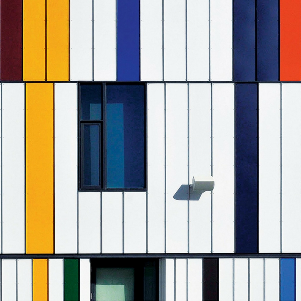
People are wired differently and our experiences, abilities and associations affect the way we perceive visual stimuli. Not only do we perceive colors differently from each other, we also use colors in multiple ways across cultures. For example, in a city as diverse as Toronto, many people come from cultures that use richer colors more liberally in everyday applications. A space that is exemplary of this diversity is Daniels Spectrum, a community hub that serves as both a performance space and working space for multiple arts organizations, situated in the recently redeveloped area of Regent Park.
For our work on the exterior façade and internal environment, we considered this notion and brainstormed how we could celebrate this sense of diversity and provide a welcoming atmosphere for all. We used a unique algorithm to distill the flags of the countries of where residents and community members had originated from, into simplified colored bands. These bands served to ignite a welcoming feeling and the familiarity of home, while also speaking to the vibrancy of the community and the arts centre.
Click to continue reading